At the most basic level a consulting engagement (or any strategic project) will typically contain three-phases:
- Structure and propose a strategy
- Implement and execute on the strategy
- Track the performance of the strategy
Phase 1 and 2 are where the consultants spend most of their time, but phase 3 is also an essential part of the project to measure the success of a strategy and adjust any tactical recommendations where needed.
So, in this article, I would like to discuss some best practices for creating a dashboard, the fundamental building block of phase 3.
Dashboard defined
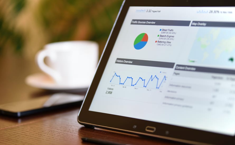
A dashboard is a powerful information management tool that is used to track KPIs (key performance indicators), metrics and other data points relevant to a business, department, or specific process. Through the use of data visualizations, a dashboard simplifies and summarizes complex data sets into manageable, digestible chunks of information. This in turn provides users with at a glance awareness of current performance to support day-to-day operations, provide greater visibility into critical business issues, and enable executive management to make more rapid and well informed decisions.
Considerations
Before creating a dashboard, first take some time to reflect on the purpose of the dashboard (i.e. operational vs analytical) with the following questions in mind:
- Who is the target audience?
- What do we want to measure?
- What are the various data sources and inputs (e.g. software, tools, and location)?
- How up to date does the dashboard need to be (e.g. live, daily, weekly, monthly, etc.)?
- What capabilities are needed (e.g. running dynamically on a separate platform vs being statically embedded in a PowerPoint deck or email)?
Design elements and tools
After the five questions above have been answered the next step is to select the appropriate data visualizations for the dashboard.
Data visualizations are graphical representations of the data and are used to simplify the transmission of sometimes complex information. The most common types of data visualizations are tables, line charts, bar charts, doughnut charts, waterfall diagrams, quadrants and gauges (used to show progress towards an objective).
Finally, decide which data visualization tool to use to power the dashboard. The most commonly used tools are Excel, Tableau, and PowerBI.
In deciding which tool is most appropriate, consider the following factors:
- Cost implications (e.g. licensing fee vs purchase price)
- Skill level needed to create and manage the dashboard
- Data infrastructure and its interoperability with third-party tools (i.e. are built-in connectors available)
- Size of the data set
- Ability to automate reports
Tips for creating a dashboard
Here are five tips for creating an effective dashboard:
- Mock-up the dashboard on a piece of paper or Excel/PowerPoint using dummy data: Draw boxes for each data type to get a sense of the layout and add quick sketches of the type of graphs. This mock-up will help to get everyone on the same page and gain pre-approval from various stakeholders before significant time is committed to creating the actual dashboard. It will also prevent frequent back-and-forth adjustment that is likely to happen later in the process.
- Keep the dashboard simple: A simple, easy-to-understand dashboard is much more effective than a “pretty” dashboard. Avoid the temptation to add 3D effects, gradients, extra shapes, and other bells and whistles. If it takes the user several minutes to understand the purpose of the dashboard, then that is likely a sign that the dashboard is not effective. Keep in mind that the most informative dashboards are cherished for their simplicity and readability.
- Add alerts for important information: If certain aspects of the dashboard need to be highlighted or quickly convey the status of key data, add alerts (or red, yellow, green boxes/symbols). Enable the alerts to pop-up or the boxes/symbols to automatically update based on the values in the data table. The key is to establish and stick to a consistent design convention.
- Use different tabs (if the dashboard is built in Excel): Keep the dashboard organized by using different tabs for different things. For example, one tab will hold the raw data, one tab will hold the pivot tables built on the raw data, and one tab will hold the charts/graphs build on the pivot tables. This will allow the user to quickly navigate through the Excel file.
- Perform reconciliation on the data before making the dashboard live: A dashboard is merely a visualization tool that is based on the raw data that it feeds from. When multiple data sources are involved, which requires consolidation, this could easily distort the information and represent an inaccurate picture that can stem from incorrect manual input, misalignment on metrics, different formatting layouts, or technical errors. Always reconcile the data before producing and launching the dashboard.
Final thoughts
Whether you are a consultant building a dashboard for a client, a research analyst reporting on an industry, or a venture capitalist tracking a portfolio company’s performance, dashboards live and breath in our daily work life.
The importance of dashboards is often overlooked because they tend to be integrated so flawlessly as part of the job. However, taking the time to understand how to create a dashboard from scratch will help you to better understand the business and broaden your viewpoint by stepping into different stakeholder’s shoes.
Jason Oh is a Senior Consultant, Strategy & Customer at EY with project experiences in commercial due diligence and corporate strategy planning. Previously, he was a Management Consultant at Novantas with a focus on the financial services sector, where he advised on pricing, marketing, channel distribution, digital transformation and due diligence.
Image: Pexels
